Atelier
UX/UI Designer
4 Weeks
(2 weeks UX, 2 weeks UI)
Google Forms –Notion –Figma –Figjam
Overview
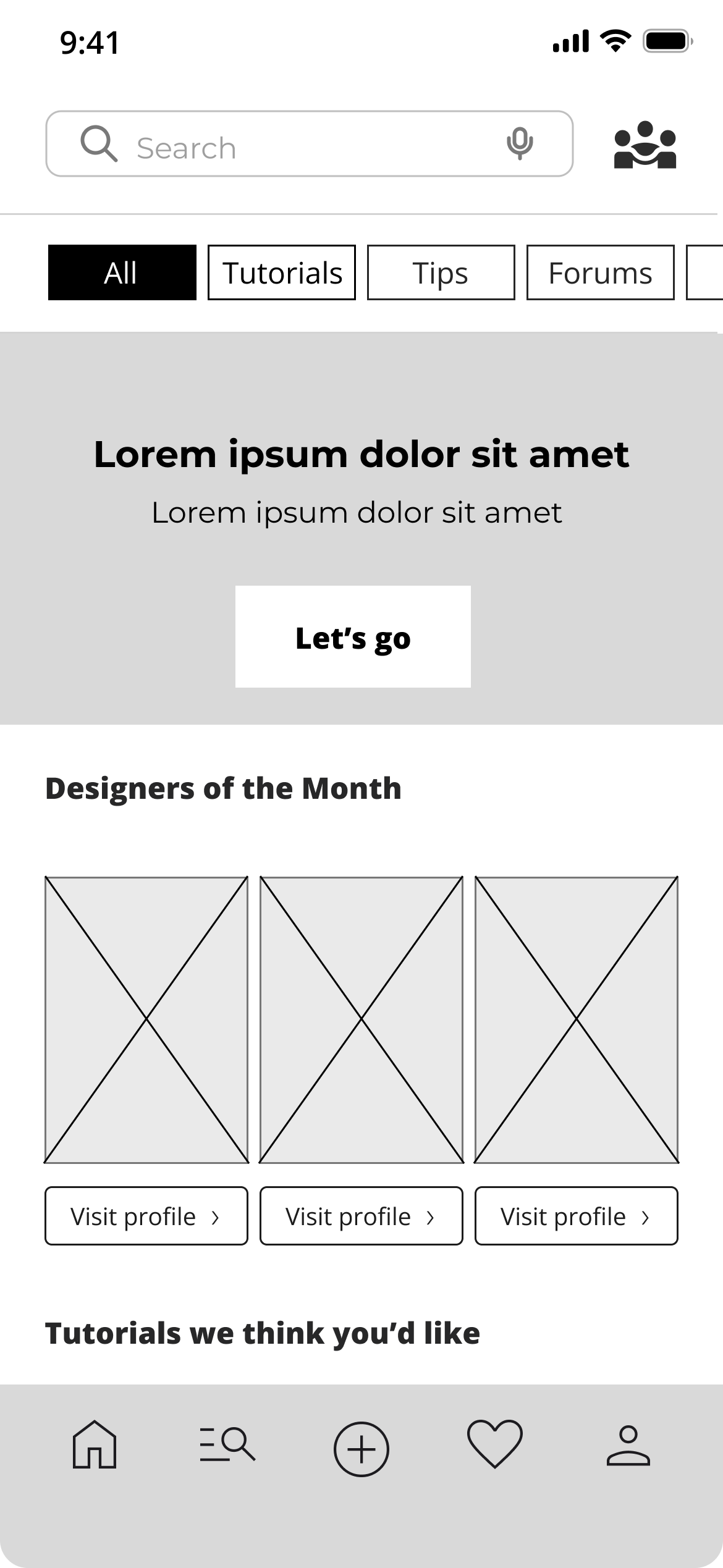
Atelier is a P2P fashion marketplace and creative community built for young designers who want to create without limits.
It helps them find affordable materials, share their work, learn from others, and feel supported throughout their creative journey.
The mission: Make creativity accessible — no matter the budget.
🔑 Key impacts

🎯 The Challenge
The idea started with a friend, a fashion student struggling to find affordable materials for her projects. She wasn’t alone. Many young designers feel the same: limited budget, limited access, limited support.
👉
🕵️ Research
To validate this need, a user survey was conducted among 100 participants. The data strongly echoed the initial observation:
- Materials are too expensive (100%)
- Young creators want connection (31%)
- Many want to sell their own designs (77%)

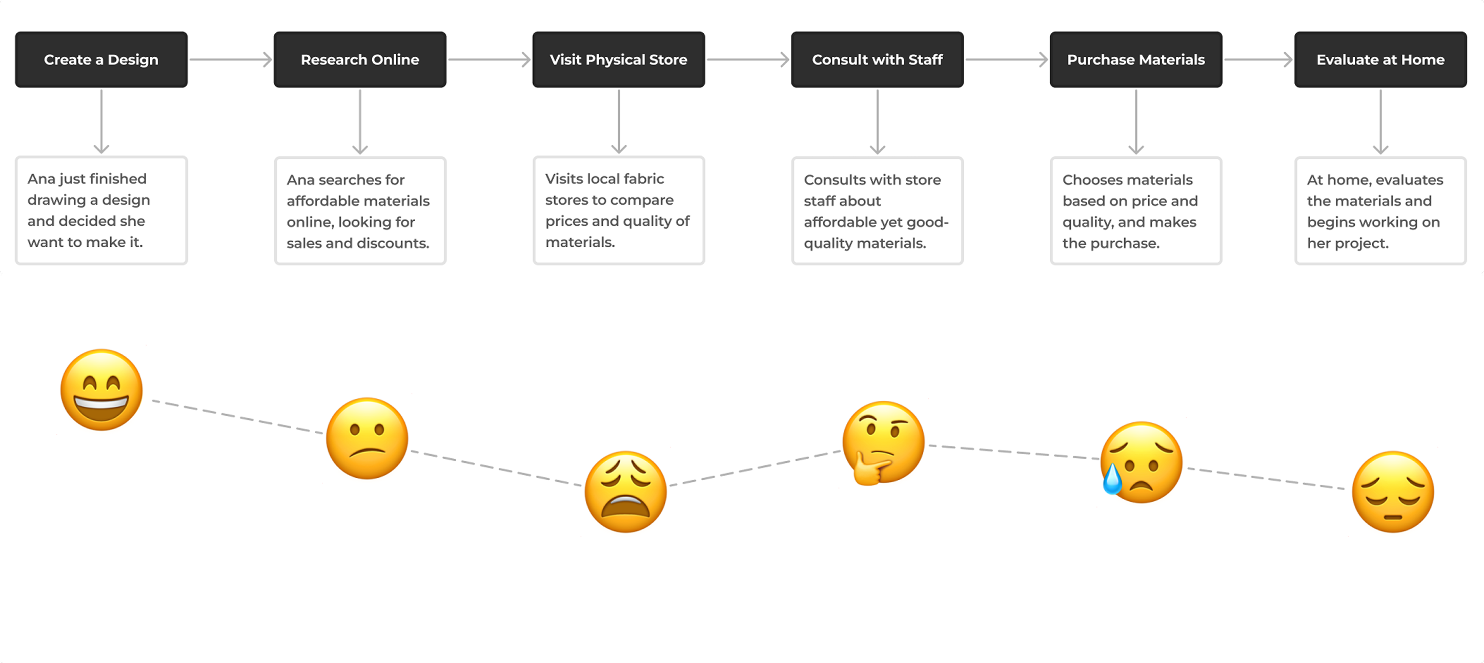
Meet Ana Sanchez,
a 20-year-old fashion design student, struggles to find low-cost materials and seeks flexible learning options. Atelier was designed to meet her needs: affordable materials, networking opportunities, and a supportive, learning environment.
"My budget shouldn't limit my creativity. I need resources that help me save and learn."
Ana's Journey:
The Pain Scenario (Before Atelier) The following journey map illustrates the frustrations Ana faces when sourcing materials and seeking community support, underscoring the necessity for a unified platform.
This was the aha! moment.
Atelier had to be more than just a shop—it needed to be the support system that fuels creativity, not stifles it.
🔎 The Competitive Landscape
When dissecting the market, a disturbing truth emerged:
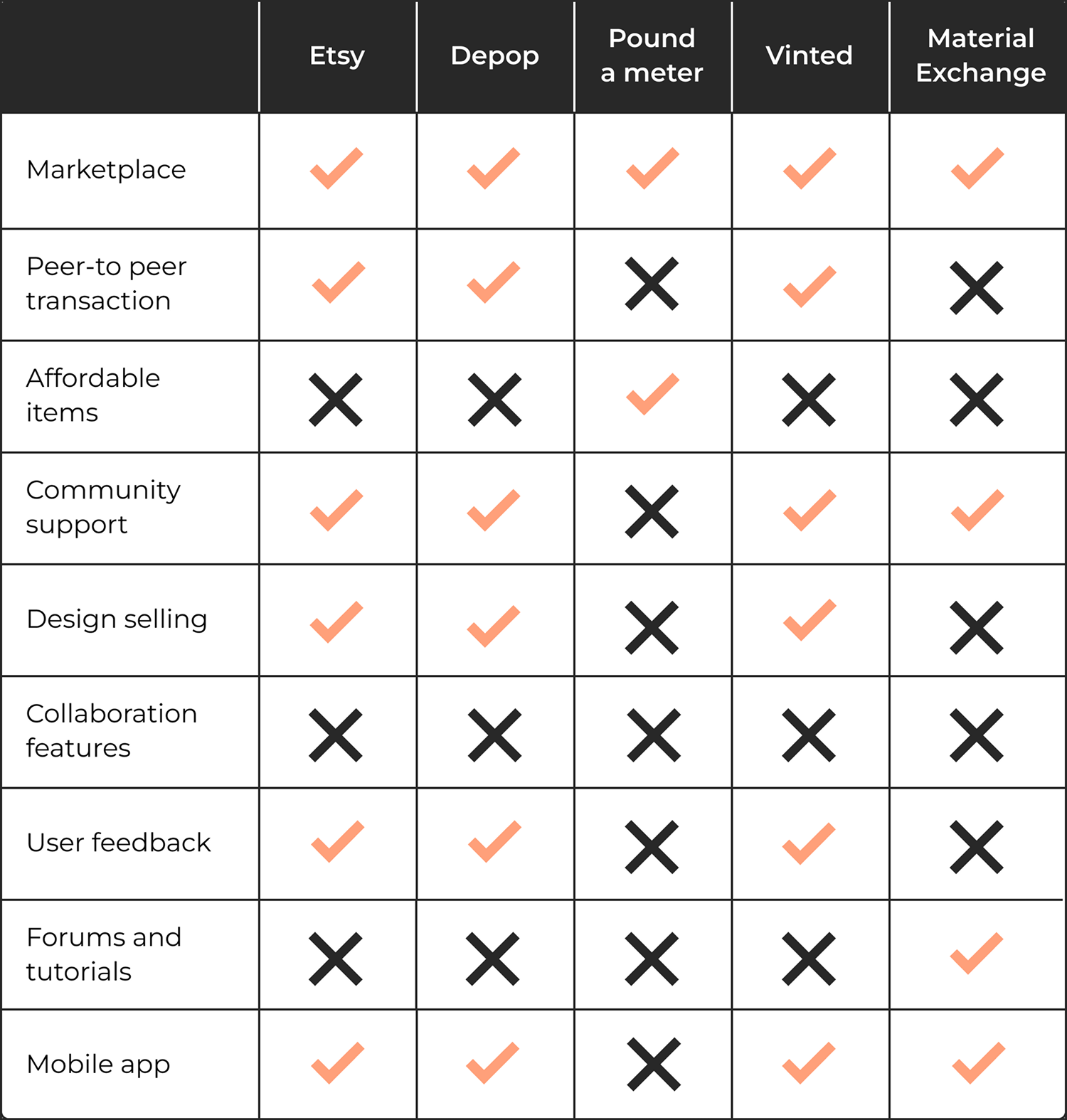
Every major platform was missing the mark. On one side, we had the P2P giants, laser-focused on transactions but utterly devoid of soul or community. On the other, the specialty material stores offered quality, but at a price point that condemned creative students like Ana from the start.
The analysis revealed a strategic blind spot:
No existing solution dared to combine the efficiency of a peer-to-peer market with the warmth and support of a genuine learning community.
This competitor weakness became our strength.
🏆 The Goal
The aim was to create a space that felt:
✅ Affordable (through P2P sourcing)
✅ Community-Focused (fostering exchange and support)
✅ Inspiring (offering tutorials and designer spotlights)
✅ Intuitive (for seamless browsing, buying, and selling)
🤔 Defining the opportunity
Based on Ana's challenges and the research insights, the problem was reframed using "How Might We" questions to guide the design process:
“How might we…”
- make quality fashion materials affordable and easily accessible through a creator-to-creator exchange marketplace?
- build a trustworthy digital community that encourages collaboration, resource sharing, and peer-to-peer learning?
- design a simple and secure P2P transaction flow so that users feel confident both listing their surplus and making a purchase?
- intuitively integrate learning resources (tutorials, designer profiles) so users can develop their skills without feeling isolated or overwhelmed?
↪️ Designing a simple and manageable experience
The design phase focused on translating strategic HMW questions into a simple, functional MVP.
I started with a Crazy 8 session to clarify the essentials: a smooth, trustworthy, and inspiring experience.
The session covered crucial screens, from the homepage, filters, and product page to the community page, ensuring a comprehensive design approach.
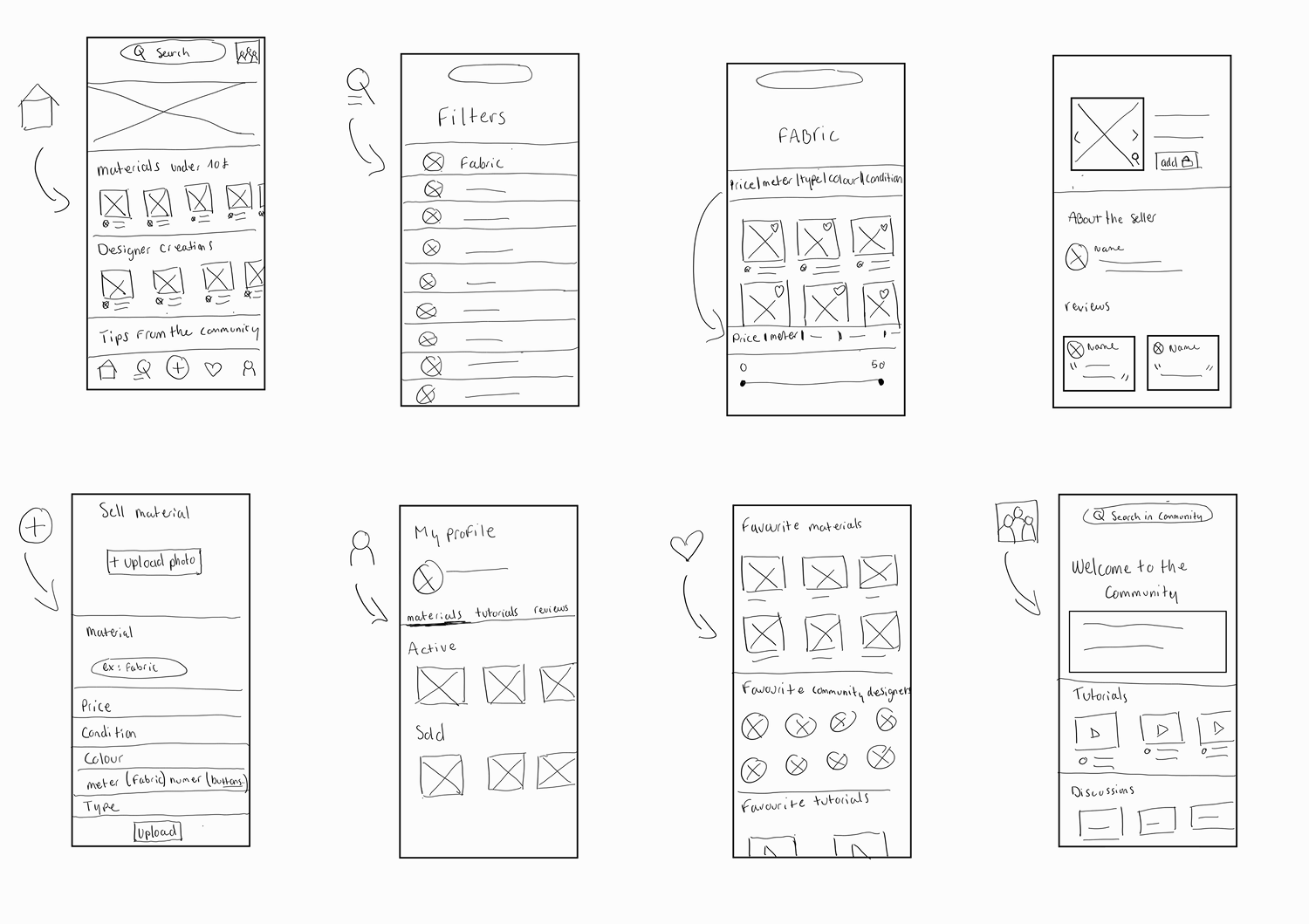
These initial sketches immediately solidified our four design imperatives:
- The Transaction: Make P2P buying/selling easy and ultra-simple.
- The Trust: Integrate social proof (ratings/reviews) to build confidence instantly.
- The Know-How: Weave tutorials and advice directly into the shopping experience.
- The Hunt: Optimise filters for efficient, low-cost material sourcing.
💡 From Idea to Action
Once the concepts were locked, I developed the Happy Path—the friction-free journey for a user like Ana to achieve her goal. This flow served as the blueprint for turning a pain point into a successful transaction.
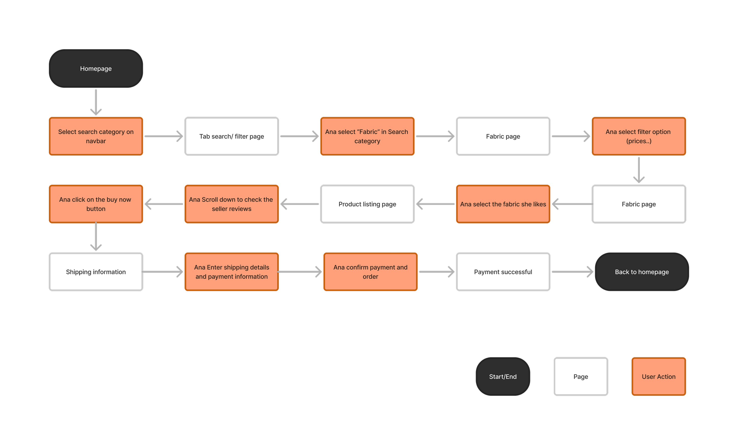
Core Path: Find → Trust → Buy.
🎨 Visualising the User Journey : Testing and Iteration
After developing the mid-fidelity wireframes, participants tested the core flows. User feedback was essential for refining the design and ensuring usability.
faster material discovery


Small changes, big impact.

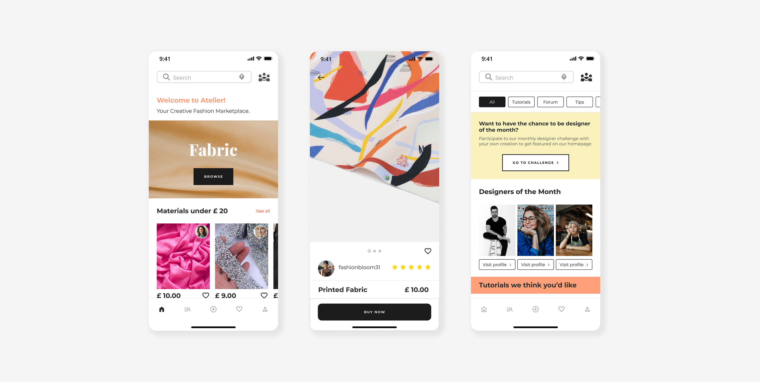
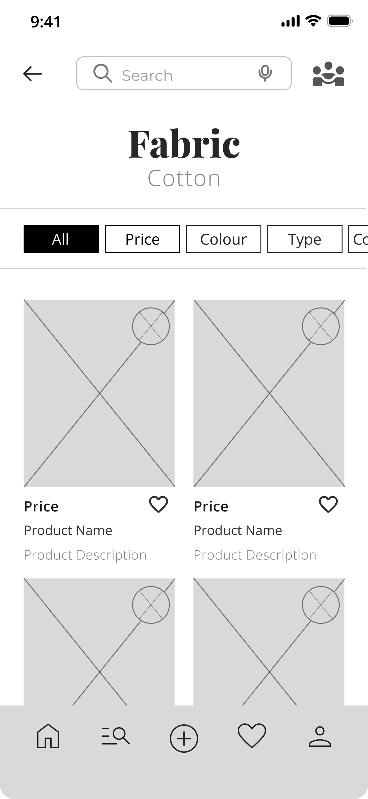
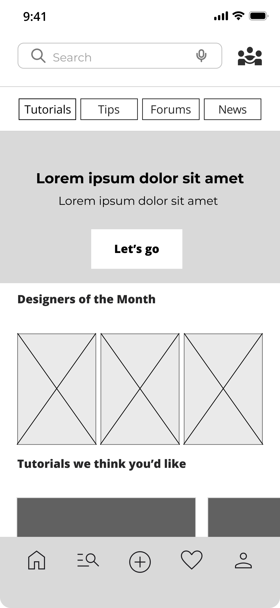
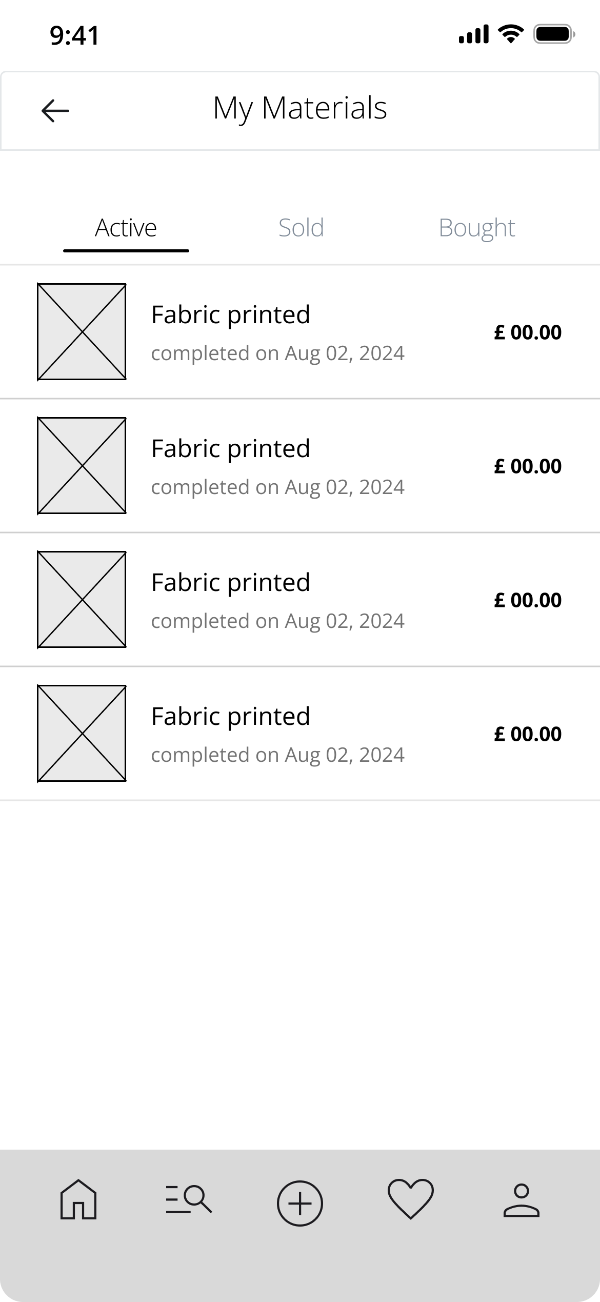
🧵 Bringing Atelier to Life
A clean, friendly, and creative mobile experience:
The mobile version was designed with a focus on:
- clear navigation between Marketplace & Community
- visible ratings for instant trust
- fast-access filters
- a warm, professional atmosphere built for creators
Atelier is meant to feel like a place where you want to create.
💁♀️ What I Learned
This project taught me how to:
- Turning financial barriers into product opportunities
- Balancing marketplace logic with community features
- Designing trust inside a P2P system
- Grounding design decisions in insights rather than intuition
🚀 What’s Next
what I plan with Atelier :
- Advanced designer profiles
- Monthly creative challenges
- Identity verification for safer P2P exchanges
- Even faster listing flow
- +40% community engagement
- Listing a material in under 2 minutes