Chromatik
UX/UI Designer – Front-End Developer
12 months (Final school project)
Google Forms –Notion –Figma –VS Code –HTML–CSS- Javascript
Overview
Chromatik is a platform designed to help people find companions to attend concerts and festivals with. Built over one full academic year, the project focuses on reducing the hesitation of going to events alone by creating a smooth, friendly, and community-driven experience.
🔑 Key impacts

🎯 The Challenge
I’ve always loved the idea of going to concerts and festivals — the lights, the energy, the shared emotions. But when I talked to people around me, I kept hearing the same sentence...

🕵️ Research
To validate this feeling, I launched a survey.
52 people responded — and the data echoed exactly what I had heard:
- 100% prefer attending events with someone
- 74% have skipped an event because they had no one to go with
- 62% are open to meeting new people… if the experience feels safe and easy
That was the turning point...
Chromatik wasn’t just a “nice idea”.
It solved a real emotional barrier.
🏆 The Goal
I wanted to create a place that felt:
✅ simple
✅ safe
✅ welcoming
✅ built for people who just want to enjoy music together
No overwhelm.
No noise. ( just some nice music)
Just a smooth path from discovering an event → finding people like you → going together.
🤔 Defining the opportunity
Based on the research, I reframed the problem through “How Might We” questions to guide the design:
“How might we…”
- help users feel confident attending events even if their friends can’t join?
- make it easy to find people who plan to attend the same concert?
- create a safe, comfortable environment for meeting new people?
- encourage connection before the event, so users don’t feel like strangers when they arrive?
These HMW questions shaped every design decision...
↪️ Designing a simple and manageable experience
Before jumping into wireframes, I mapped the key journey of our users: finding an event and joining a group.

User Flow Focus:
- Discover an event via search or recommendations
- Browse available groups attending the event
- Select a group that feels like a good fit (size, interests, familiarity)
- Join the group and access messaging to connect before the event
💡 From Insights to Ideas
Rapid ideation to explore multiple directions
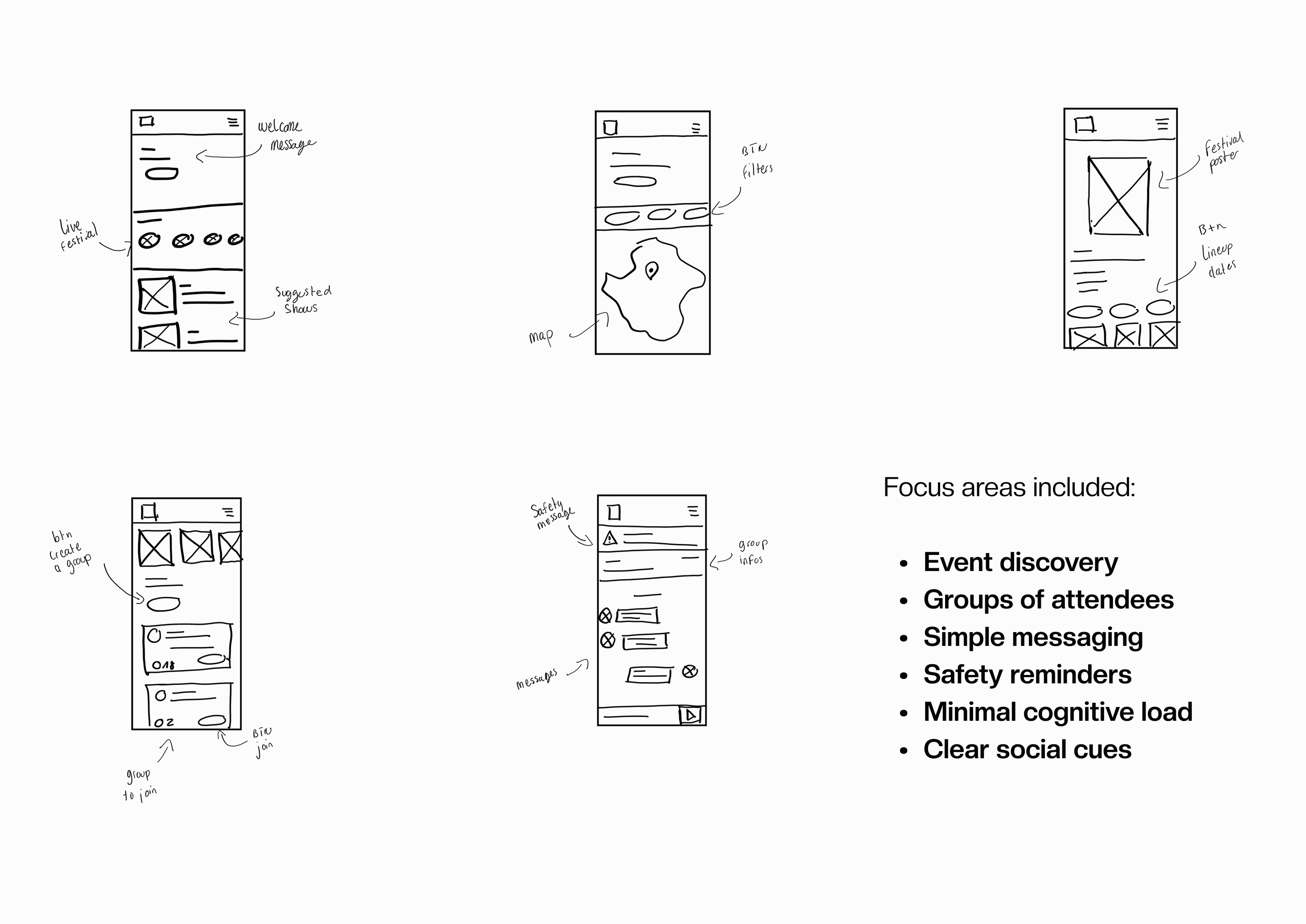
🎨 Visualising the User Journey
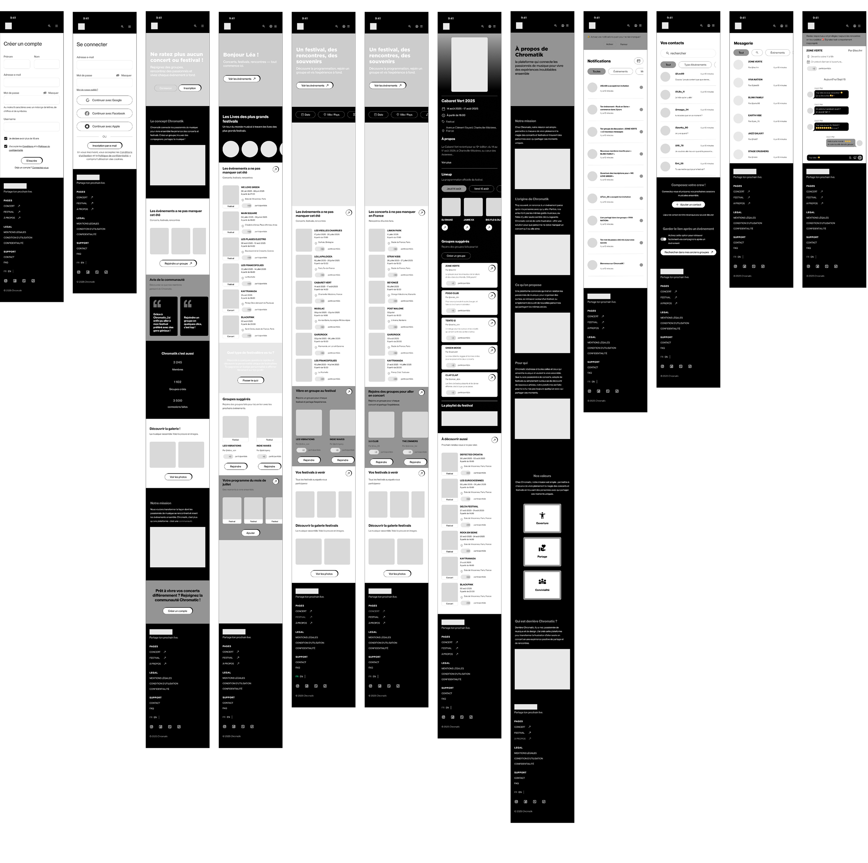
I designed high-fidelity wireframes to visualise the core experience of Chromatik.
These screens focus on making the process of finding events and joining groups simple, intuitive, and reassuring.
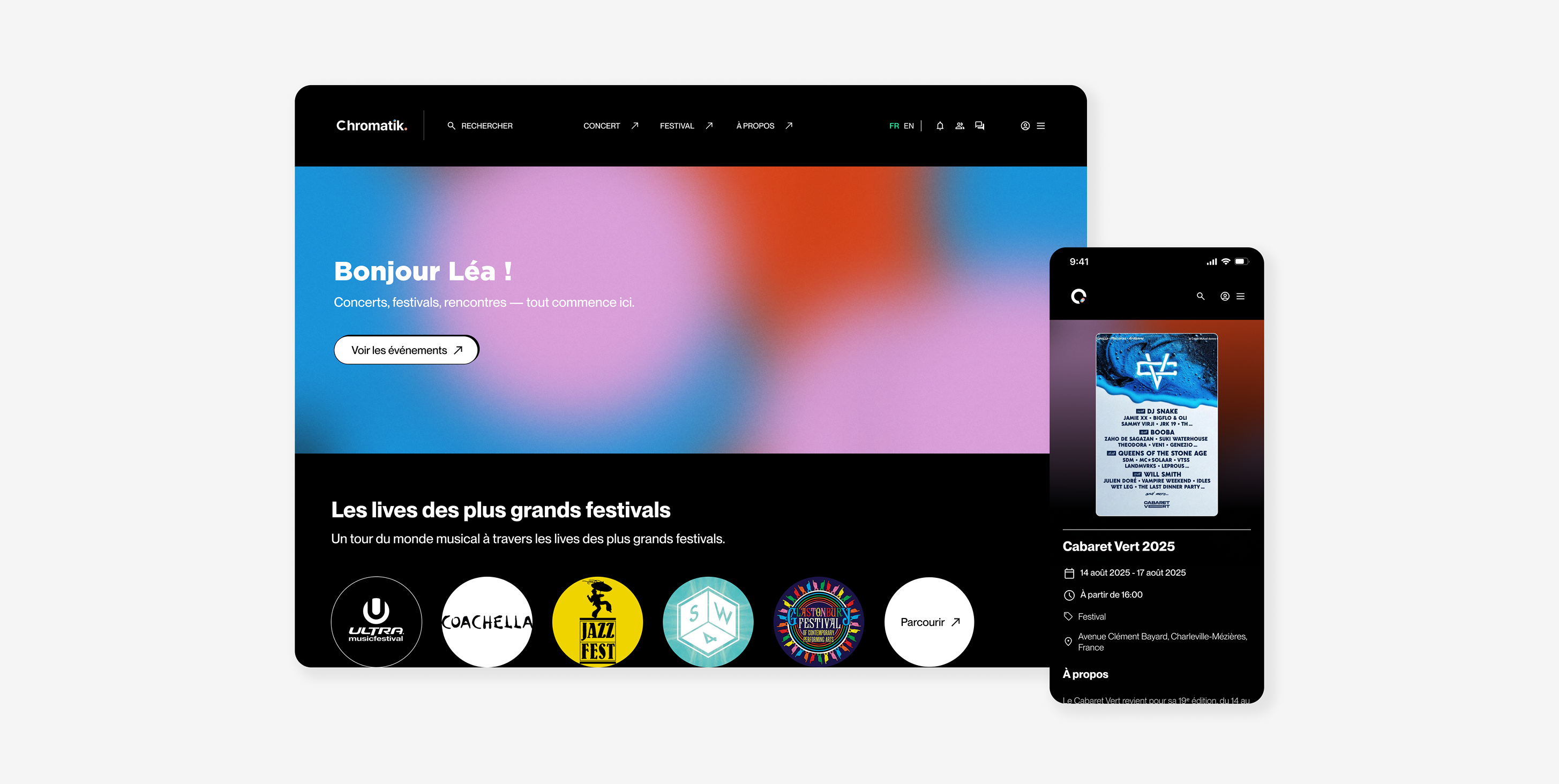
🎵 Bringing Chromatik to Life
Final Mobile Experience
This video showcases the final mobile design of Chromatik. It brings to life the full user journey — from discovering upcoming concerts to joining a group of attendees and starting a conversation before the event.
The mobile version was designed with a focus on:
- Simple and intuitive navigation
- Clear event and group information
- Reassuring social cues
- A friendly and comfortable atmosphere
- Easy access to messaging
This prototype captures the core experience of Chromatik and how users can confidently connect with others before attending a concert.

💁♀️ What I Learned
This project taught me how to:
- Translate emotional challenges into clear UX opportunities
- Design flows that reduce hesitation and boost user confidence
- work end-to-end: research → UX → UI → front-end development
- balance simplicity, safety, and sociability in a community-driven product
🚀 What’s Next
what I plan with Chromatik :
- User verification to increase safety during meetups
- Stronger group features, such as group roles or event planning tools
- Native app version
- Reduce event drop-out rate from 74% to under 40%
- Boost engagement: minimum 1 group joined per active user
- User trust signals, like badges or reputation indicators